Overview
Jobly ships with a built-in web dashboard for monitoring and managing jobs.
Setup
app.UseJoblyUI(); // Serves at /jobly
To restrict access to the dashboard, see Dashboard Auth.
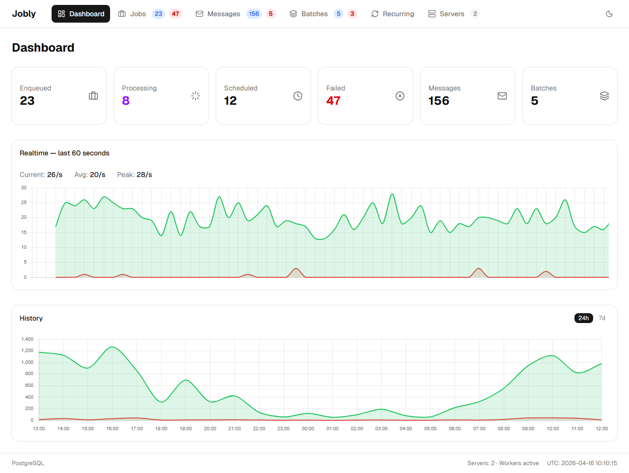
Dashboard
The main dashboard shows real-time statistics, live graphs, and server status.
Metric Cards
Six clickable metric cards are displayed at the top of the dashboard:
- Enqueued — jobs waiting to be picked up
- Processing — jobs currently being executed
- Scheduled — jobs scheduled for future execution
- Failed — jobs that have failed
- Messages — pub/sub messages
- Batches — batch groups
Each card navigates to its corresponding page when clicked. Cards use conditional colors: Processing turns purple when the count is greater than zero, and Failed turns red when the count is greater than zero. All other cards use neutral styling.
Graphs
Below the metric cards, the dashboard includes two graphs:
- Realtime graph — a live jobs/sec line chart that updates continuously
- Historical graph — a bar chart with a 24-hour / 7-day toggle showing succeeded and failed job counts over time